ShopDreamUp AI ArtDreamUp

Deviation Actions
Daily Deviation
Daily Deviation
January 16, 2011
Congratulation DD by *Esi0n This is a very interesting concept that dA could consider when a deviant is just receiving a DD. litttle-princess states, "when I got my first and last DD a while ago, I was like,''what? Did i get a DD?'', I could not believe when a deviant commented, ''congratulations on the DD''. If I had received a DD Message I would not have taken so long to believe it." I have to agree. It would help to cushion the "shock" if it came into the message center like other Topics, where it would be seen by the deviant right away, before wondering why there are a bazillion messages in the message center!
Featured by WDWParksGal
Suggested by litttle-princess
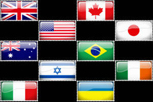
COUNTRY FLAG STAMP COLLECTION
Show your support/allegiance to a country by proudly flying the flag on DeviantART.
$1/month


Suggested Deviants


Suggested Collections


You Might Like…


Featured in Groups


Description
It had been a long time since I had suggested something to improve DeviantART.
I have never had DailyDeviation :sad: but I asked has a person who had one recently to say to me if when we had a DailyDeviation, a message warned us, I learnt that not, it surprised me and thus I decided to create a small message who would warn that one of your creations was selected as DailyDeviation.
I use the script [link] by ~bentomlin I have modify a little the appearance so that the DailyDeviation also appears at the top of the page of DeviantART
Hope you like it !
____________________
WOW ! A DD
Image size
1040x170px 93.57 KB
© 2010 - 2024 Esi0n
Comments242
Join the community to add your comment. Already a deviant? Log In
Salut, donc je vais poster ma deuxième critique sur cette idée plutôt bien trouvée, très originale et bien sympa <img src="e.deviantart.net/emoticons/s/s…" width="15" height="15" alt="
- Dans la globalité, c'est vraiment pas mal, la police d'écriture est très bien trouvé, les effets sur le texte sont originaux et donnent un vrai effet "d'or", enfin tout va plutôt bien.
- Je pense qu'il faudrait mettre un peu plus de contraste entre le fond et la couleur du texte, ce que je veux dire c'est qu'on voit mal le haut du texte par rapport au fond, c'est pas assez contrasté.
- Je ne centrerai pas le texte moi, je pense que ça serait mieux aligné avec le coeur du titre (sur la même colonne).
- Je mettrai le "view more" carrément à droite, sur le même alignement que la croix et la flèche à coté du temps depuis la publication du message
Ce ne sont pas de "grosses choses", mais je pense que ça aiderait à faire quelque chose de plus propre, plus fini, plus deviantART quoi <img src="e.deviantart.net/emoticons/let…" width="15" height="15" alt="
J'espère en tout cas que cette petite critique va t'aider, et j'attends la mise à jour !
Bonne continuation à toi, car tu es en train de monter en flèche, et ça se voit dans tes dernières réalisations <img src="e.deviantart.net/emoticons/w/w…" width="15" height="15" alt="